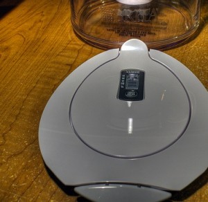
Click the image for Creative commons attribution.
I love those things. But as design goes, (and I’m not sure if this is just me) it seems that the guy making it is unaware that it will regularly be tilted to about 45 degrees or more. It’s a pitcher. The primary purpose it has been assigned on this planet is dispensing water. By tilting it.
Yet, as soon as you tilt it beyond about 15 degrees, the lid that up until this point has simply been a suave looking white piece of plastic goes rogue, clacking onto the floor in front of the fridge.
Which makes me want to throw it out every time I use it, despite how cool it looks. No matter how sleek, well designed, and cool something looks, if it doesn’t work, it’s useless.
We are no longer talking about water pitchers. If your digital marketing strategy is focused on high quality production and presentation to the exclusion of usefulness, your potential customer will opt for less shiny, more functional alternatives.
If you build a compelling case for engagement on your blog, but then have “your comment is being moderated” as the primary feedback when somebody finally does take the time to say something, the lid just fell off the water pitcher.
If you make a flawless $10,000 ad campaign for your product, but the online ordering page requires a degree in computer science and a minor in long-suffering, your lid just fell off. (tweet that sentiment)
In the digital world, there are just too many things that you can do in “one click.”
That’s not to say that everything should be a clear call to action or “click here.” That comes off as a bit sleazy. (Sign up for my emails for a free course on how NOT to be a sleazy salesman.)
It’s just that when you DO call somebody to action, make it simple and rewarding, like a cup of freshly filtered water.
If you need me, I’ll be cleaning up the water I poured on my foot when I leaned over to pick up a cool-shaped plastic lid earlier.
